by fontocean | Mar 31, 2014
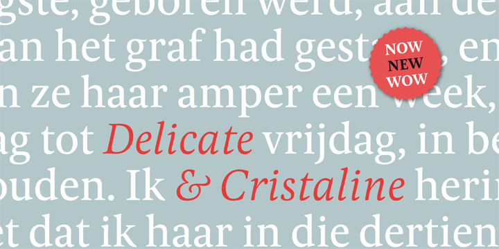
Pona, the simple typeface belongs to the classic serif family. The font is an elucidation of some of the most renowned serif fonts such as Goudy, Times, Georgia, and Garamond. Pona offers elusive letterforms in conjunction with a large x-height. It also circumscribes...

by fontocean | Feb 15, 2014
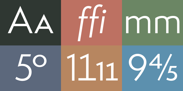
Semplicita Pro is an all-new sans serif design that fluently overlaps the tri-cornered carves up between the geometrical, humanist, and gothic sans serifs. The designers started by reassessing Semplicità, Alessandro Butti’s 1930 design ifor Nebiolo. The font is...

by fontocean | Sep 28, 2013
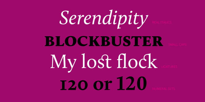
Calluna was born essentially by accident. The designer was probably in need of some break from designing Museo when he fiddled around a bit to come out with a full slab serif. The designer then put slab serifs on Museo stems. This gave birth to something really nice...

by fontocean | Sep 5, 2013
Ciutadella was initially custom-built by Mario Eskenazi’s studio, Ciutadella is a versatile geometric sans serif. The simple, clean and direct family is dynamic due to its overhaul simplicity that reflects an “open” personality. It is also quite suitable to be used...

by fontocean | Jul 30, 2013
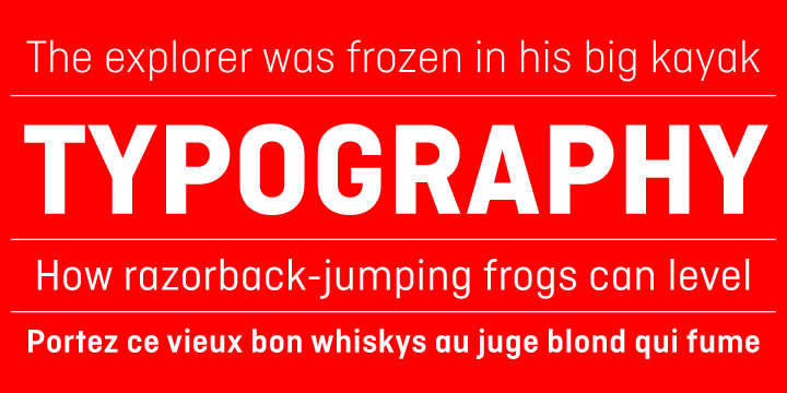
Wayfinding Sans was designed official by designer Ralf Herrmann. This talented designer started off with the project after extensive study in the field. He actually drove tens of thousands of miles to explore the legibility of road signage typefaces in over dozens of...
